Avenir Alternatives Font

Adrian Frutiger designed Avenir in 1988, after years of having an interest in sans serif typefaces. In an interview with Linotype, he said he felt an obligation to design a linear sans in the tradition of Erbar and Futura, but to also make use of the experience and stylistic developments of the twentieth century.
The word Avenir means “future” in French and hints that the typeface owes some of its interpretation to Futura. But unlike Futura , Avenir is not purely geometric; it has vertical strokes that are thicker than the horizontals, an “o” that is not a perfect circle, and shortened ascenders. These nuances aid in legibility and give Avenir a harmonious and sensible appearance for both texts and headlines.
Here, we are providing you some free awesome similar fonts to Avenir font family.
Please Note:
These are free similar fonts to Avenir. We tried our best to find the best matching fonts of Avenir font family.
Hope you will find these collections helpful!
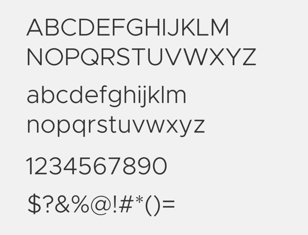
Avenir Light – [Metropolis Light]
Download Search Fonts
Avenir Book – [TT Norms Rg]
Download Search Fonts
Avenir Roman – [Metropolis Regular]
Download Search Fonts
Avenir Medium – [Metropolis Medium]
Download Search Fonts
Avenir Heavy – [Metropolis Semi Bold]
Download Search Fonts
Avenir Black – [Metropolis Bold]
Download Search Fonts
Avenir Italic
Download Search Fonts
Other Free Avenir Similar Fonts
Geomanist
Geomanist designed and shared by atipo ®. You can use for branding projects, labels, apparel design, typography pieces and more, with support for most western languages.
Get the free version of Geomanist font family.
Download Search Fonts
Gibson
The Gibson font family hits the right spot for many people and on many levels. It is a humanist sans serif typeface designed by eminent Canadian type designer Rod McDonald FGDC, and produced by Patrick Griffin and Kevin King of Canada Type, to honour John Gibson FGDC (1928-2011), Rod’s long-time friend and one of the original founders of the Society of Graphic Designers of Canada (GDC).
As well as paying tribute to John Gibson’s productive life and love of the typographic arts, the Gibson family is intended to be a mainstay of the future of Canadian design education. Many Canadian design schools and institutions will be making it part of their larger type piracy education programs. The 8-font family is available at token pricing to make it especially affordable for design students.
For less than the price of a design textbook, a student can now have a sturdy and contemporary humanist sans serif family that fits pretty much any design application, and will remain useful long after academic studies and well into a professional career in design.
Download Search Fonts
Gotham
Gotham is a geometric sans-serif typeface family designed by American type designer Tobias Frere-Jones with Jesse Ragan and released from 2000. Gotham’s letterforms were inspired by examples of architectural signage of the mid-twentieth century. Gotham has a relatively broad design with a reasonably high x-height and wide apertures.
Since creation, Gotham has been highly visible due to its appearance in many notable places. This has included Barack Obama’s 2008 presidential campaign, Michigan State University branding, and the 2016 federal election campaign of the Australian Labor Party.
Download Search Fonts
Montserrat
The old posters and signs in the traditional Montserrat neighborhood of Buenos Aires inspired Julieta Ulanovsky to design this typeface and rescue the beauty of urban typography that emerged in the first half of the twentieth century. As urban development changes that place, it will never return to its original form and loses forever the designs that are so special and unique.
The letters that inspired this project have work, dedication, care, color, contrast, light and life, day and night! These are the types that make the city look so beautiful. The Montserrat Project began with the idea to rescue what is in Montserrat and set it free under a libre license, the SIL Open Font License.
Download Search Fonts
Museo Sans
Museo Sans is based on the well-known Museo. It is a sturdy, low contrast, geometric, highly legible sans serif typeface very well suited for any display and text use.
This OpenType font family offers also support for CE languages and even Esperanto. Besides ligatures, automatic fractions, proportional/tabular lining and old-style figures, numerators, denominators, superiors and inferiors MUSEO also has a ‘case’ feature for case sensitive forms.
Download Search Fonts
Soleil
Soleil is a geometric sans-serif typeface designed by Wolfgang Homola and published through TypeTogether in 2011. It’s interesting for a geometric sans in that it has asymmetrical counters which immediately sets it apart from something like Futura, giving it a more fluid and contemporary feel. Soleil is French for sun which is an apt name as this typeface brings warmth to the geometric sans genre.
Download Search Fonts
Conclusion
So, these are some best quality free Avenir alternative fonts that are very close to the original design of Avenir and some fonts are free for personal and commercial use. If you think we did great Avenir alternative collections then share this post with your favorite social networks, or if you think we missed any favorite alternative to Avenir, then let us know in the comment form below.
Enjoy!!


