Helvetica Alternatives Font
30,000+ Best Fonts Download
This typeface was initially released as Neue Haas Grotesk, and was designed in 1957 by Max Miedinger for the Haas’sche Schriftgiesserei (Haas Type Foundry) in Switzerland.
The name was changed to Helvetica (an adaptation of Helvetia, the Latin name for Switzerland) by Walter Cunz when D. Stempel AG, a major stockholder in Haas, reworked the design for Linotype GmbH in Frankfurt, a major stockholder in Stempel. The Mergenthaler Linotype Company in New York, then a major stockholder of Linotype GmbH, adopted the design, and it rapidly became the most popular sanserif in the world, replacing Futura.
Helvetica is designed as a strong central series, with condensed and extended forms and extreme weights adapted and added later, a system which suited Linotype mechanical limitations and marketing philosophy, but which resulted in a family of weights that were not as well coordinated as they might have been.
Please Note:
These are free similar fonts to Helvetica. We tried our best to find the best matching fonts of Helvetica font family.
Hope you will find these collections helpful!
Helvetica Ultra Light – [Nimbus Sans Ultra light]
Download Search fonts
Helvetica Thin – [Pragmatica Extra Light]
Download Search Fonts
Helvetica Light – [Nimbus Sans Light]
Download Search Fonts
Helvetica Regular – [Free Sans Regular]
Download Search Fonts
Helvetica Bold – [Free Sans Bold]
Download Search Fonts
Helvetica Black – [Nimbus Sans Becker]
Download Search Fonts
Helvetica Italic
Download Search Fonts
Other Free Helvetica Similar Fonts
Helvetica Now
Helvetica® Now is a new chapter in the story of perhaps the best-known typeface of all time. Available in three optical sizes—Micro, Text, and Display—every character in Helvetica Now has been redrawn and refit; with a variety of useful alternates added. It has everything we love about Helvetica and everything we need for typography today. This is not a revival. This is not a restoration.
This is a statement.
This is Helvetica Now: for everyone, everywhere, for everything.
Download Search Fonts
Neue Haas Grotesk Text
The first weights of Neue Haas Grotesk were designed in 1957-1958 by Max Miedinger for the Haas’sche Schriftgiesserei in Switzerland, with art direction by the company’s principal, Eduard Hoffmann. Neue Haas Grotesk was to be the answer to the British and German grotesques that had become hugely popular thanks to the success of functionalist Swiss typography. The typeface was soon revised and released as Helvetica by Linotype AG.
As Neue Haas Grotesk had to be adapted to work on Linotype’s hot metal linecasters, Linotype Helvetica was in some ways a radically transformed version of the original. For instance, the matrices for Regular and Bold had to be of equal widths, and therefore the Bold was redrawn at a considerably narrower proportion.
Download Search Fonts
Chalet Book
House Industries developed this special version of Chalet for the House book project. They optimized the characters for better readability at small sizes and made the entire typeface more compact. They also added small caps, small cap figures, fractions and some useful OpenType features.
Download Search Fonts
Pragmatica
The typeface was designed at ParaType (ParaGraph) in 1989-2004 by Vladimir Yefimov and Olga Chaeva. A spin-off from Encyclopedia-4 type family of the Polygraphmash type design bureau (1987, Vladimir Yefimov and Isay Slutsker). Inspired by Helvetica (Neue Haas Grotesk) of Haas typefoundry, 1957 by Eduard Hoffman and Max Miedinger.
Based on the 19th century Grotesque designs, Helvetica brought a new level of mathematical accuracy to the sans serif category. Widely used for many applications, from magazines and books to advertising and headlines. Four basic styles of Pragmatica were developed in 1989 by Vladimir Yefimov.
Download Search Fonts
Adelle Sans
The Adelle Sans font family by José Scaglione and Veronika Burian provides a more clean and spirited take on the traditional grotesque sans. As is typical with TypeTogether typefaces, the most demanding editorial design problems were taken into consideration during its creation. The combination of lively character and unobtrusive appearance inherent to grotesque sans serifs make it an utterly versatile tool for every imaginable situation.
To save space and keep legibility high, Adelle Sans is available in eight weights with matching italics and includes a condensed width of seven weights with their matching italics. Each of these 30 styles hits the perfect tone as a headline punch or subdued background hum, and the condensed widths are adept at setting short texts while retaining the expected personality.
Download Search Fonts
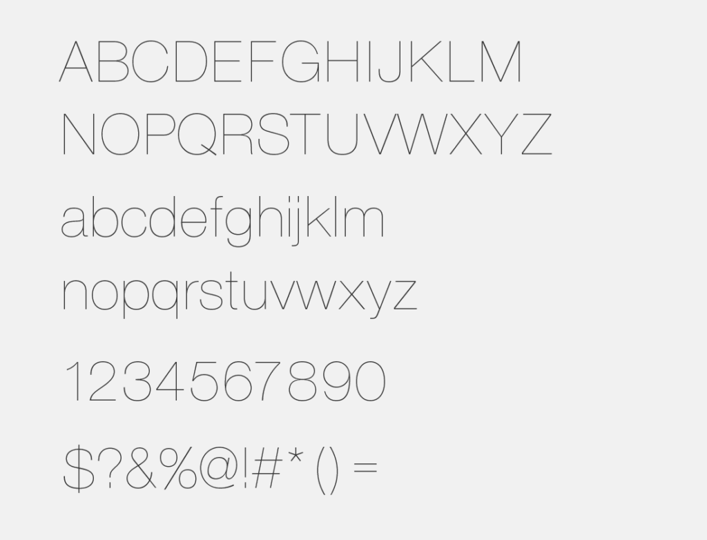
Aileron
Aileron is a sans serif font which adds my own interpretation with reference to a typeface classified as Neo-Grotesque including Helvetica.
In order to make it easy to distinguish it from the capital letter “I”, we made the letter of the lower case letter “l” curved at the end portion as a slight adjustment for the text for the text.
In addition, the dot part of, such as “i” and “j” or period in a circle, the curved portion clothoid curve By performing the process was conscious, was to get an overall soft impression. It is close to Helvetica in terms of design, but rather conceptually it is closer to Univers.
Download Search Fonts
San Francisco Display
San Francisco Display is a neo-grotesque sans-serif typeface made by Apple Inc. It was first released to developers on November 18, 2014. It is the first new typeface designed at Apple in nearly 20 years and has been inspired by Helvetica and DIN.
The San Francisco Display typeface has three main variants: SF for macOS, iOS, and iPadOS; SF Compact for watchOS; and SF Mono for the Terminal, Console, and Xcode applications. Several other variants exist for internal use by Apple.
San Francisco was first introduced in watchOS only. The next year at WWDC, Apple released the watchOS font as SF Compact and at the same time introduced SF UI (generally called SF) for OS X El Capitan and iOS 9. In macOS High Sierra and iOS 11, SF UI was succeeded by SF Pro.
Download Search Fonts
Conclusion
So, these are some best quality free Helvetica font family similar fonts that are very close to the original design of Helvetica and some fonts are free for personal and commercial use. If you think we did great Helvetica alternative collections then share this post with your favorite social networks, or if you think we missed any favorite alternative to Helvetica, then let us know in the comment section below.
Enjoy!!