Avenir Italic Alternatives Font

Adrian Frutiger designed Avenir in 1988, after years of having an interest in sans serif typefaces. In an interview with Linotype, he said he felt an obligation to design a linear sans in the tradition of Erbar and Futura, but to also make use of the experience and stylistic developments of the twentieth century.
The word Avenir means “future” in French and hints that the typeface owes some of its interpretation to Futura. But unlike Futura , Avenir is not purely geometric; it has vertical strokes that are thicker than the horizontals, an “o” that is not a perfect circle, and shortened ascenders. These nuances aid in legibility and give Avenir a harmonious and sensible appearance for both texts and headlines.
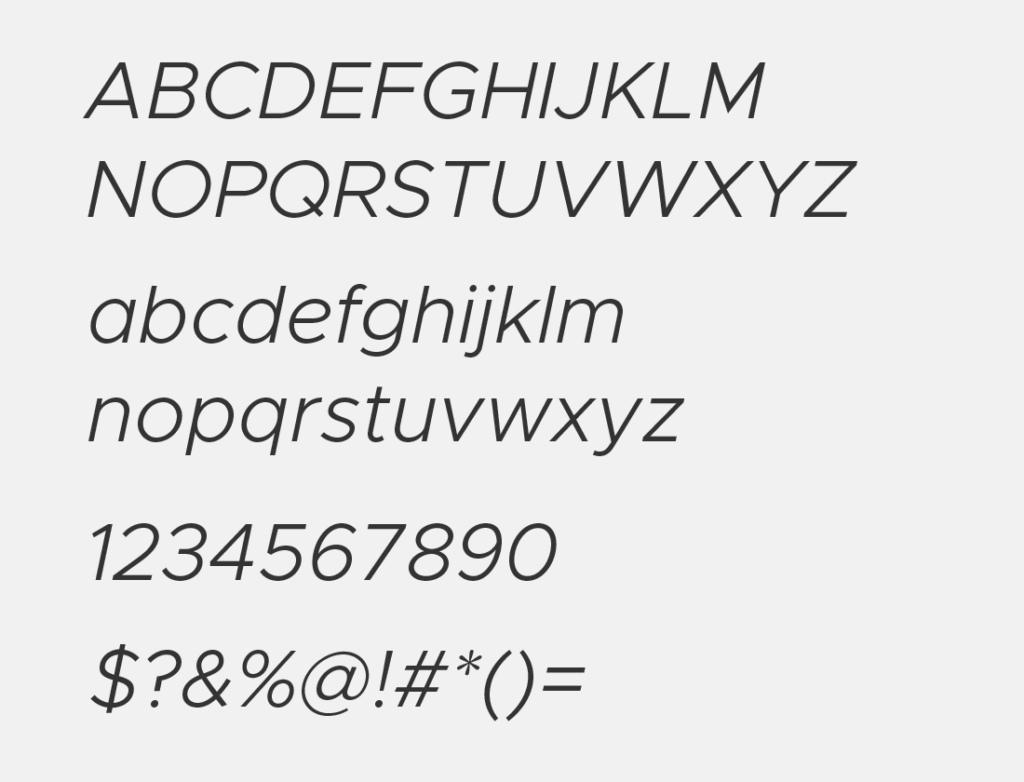
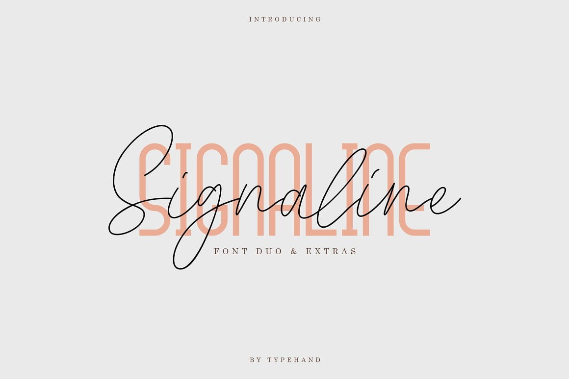
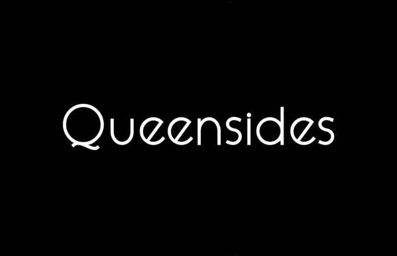
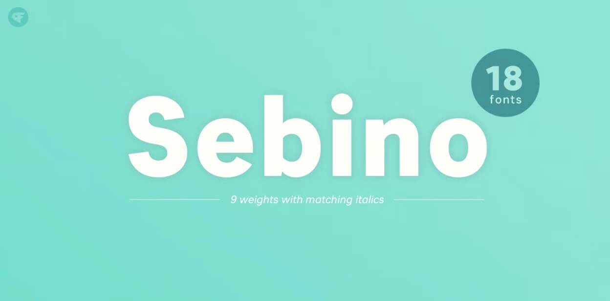
Here, we are providing you some free awesome similar fonts to Avenir Italic font family.
These are free similar fonts to Avenir Italic. We tried our best to find the best matching fonts of Avenir Italic font family.
Hope you will find these collections useful!
Avenir Light Italic – [Metropolis Light Italic]
Download Search Fonts
Avenir Book Italic – [TT Norms Italic]
Download Search Fonts
Avenir Italic – [Metropolis Italic]
Download Search Fonts
Avenir Medium Italic – [Metropolis Medium Italic]
Download Search Fonts
Avenir Heavy Italic – [Metropolis Semi Bold Italic]
Download Search Fonts
Avenir Black Italic – [Metropolis Bold Italic]
Download Search Fonts
Conclusion
So, these are some best quality free Avenir Italic alternative fonts that are very close to the original design of Avenir Italic and some fonts are free for personal and commercial use. If you think we did great Avenir Italic alternative collections then share this post with your favorite social networks, or if you think we missed any favorite alternative to Avenir Italic, then let us know in the comment form below.
Enjoy!!


